
Dark Matter Coffee is a large coffee company in Chicago, IL, known for responsibly sourcing coffee and pushing the boundaries for what coffee can be. In the pursuit of new ways to use coffee, the good folks at DMC began making mocktails, utilizing their emerging iced coffee offerings and demonstrating its versatility. To promote this, they needed recipe cards that connected both with the brand as well as creatively communicating with the customer.

Keeping in mind the distinct flavor profiles, processing methods of the individual iced coffees, and the unique names of the mocktails, each recipe card was designed as a fun personality. This was achieved with engaging color palletes, layouts, and type treatment of the card title, all while maintaining strong communicative ability.
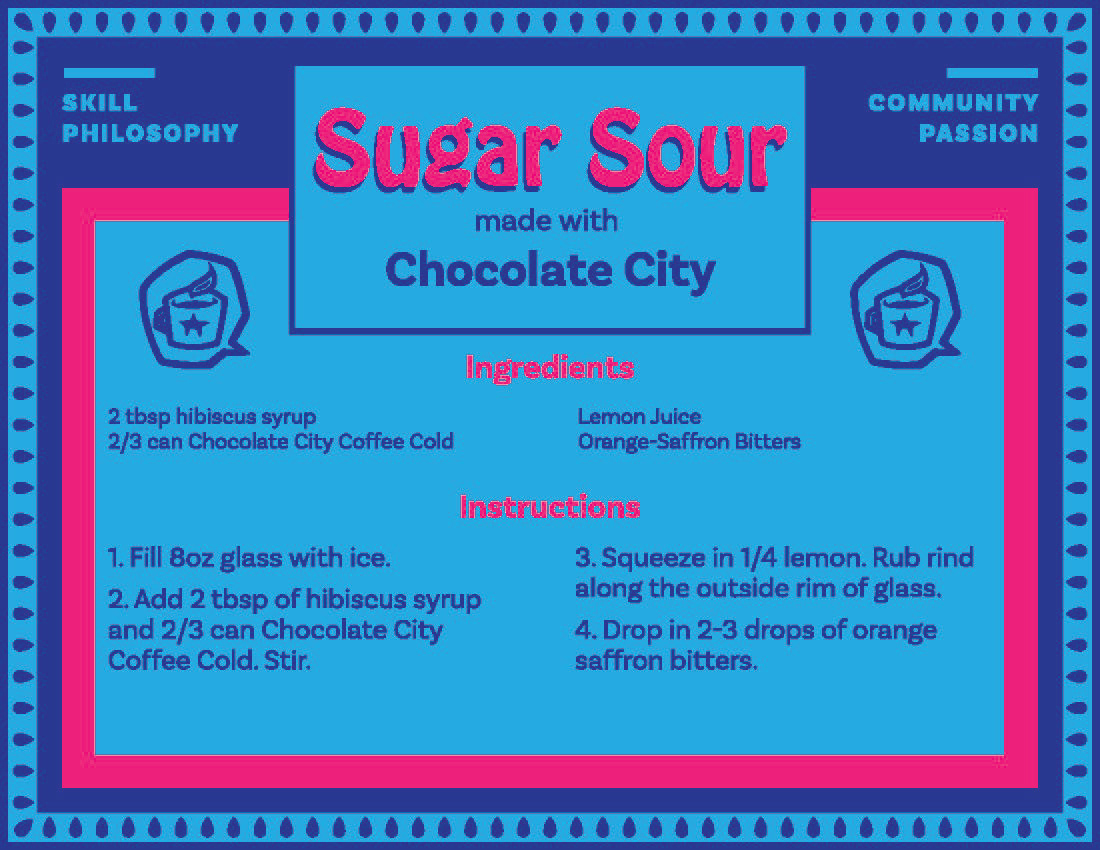
With its western sounding name, Whiskey Wimmens uses a Western-style font and desert colors. Sugar Sour resembles candy packaging with its bright color and psychedelic type treatment of the card title.
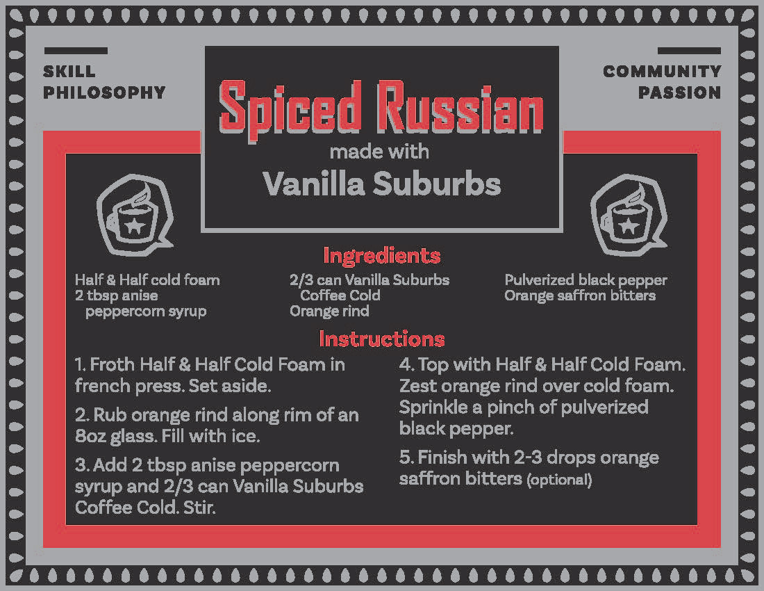
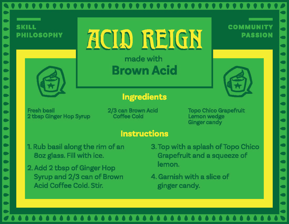
As an ode to U.S.S.R design of the early 20th century, Spiced Russian is decked out in black, gray, and red as well as narrow, bold sans serif type for the card title. Lastly, as a reference to Topo Chico as a primary ingredient, Acid Reign is treated with green and yellow, while the card title takes on a medieval typographic feel.