

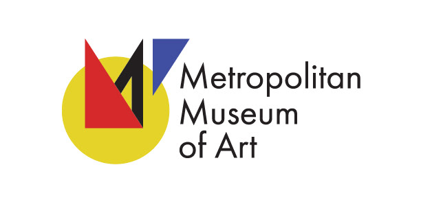
As one of the most famous art museums, The Metropolitan Museum of Art has a brand easily recognizable by anyone. This rebrand aims to move in a completely different direction, drawing inspiration from Piet Mondrian's modernist painting style. No longer focusing on MET and instead isolating the "M", this new logo takes the simple shapes the "M" is composed of and responds to it with basic geometric forms. The resulting mark is both bold and simple.


Alternative color configurations illustrate diverse uses and meanings available. A greyscale version can be used to represent black and white photography, whereas the teal version can represent ancient works that have experienced weathering.