Have you ever visited Nebraska? Me neither, which is exactly why I designed these postcards. They are inspired by the work of contemporary graphic designers with vastly different styles.

In the first card, I emulated the style of design firm Duffy, advertising Chimney Rock. Duffy’s style incorporates bright, bold colors alongside dynamic patterns, and, when coupled with masked photography, create a sense of depth and space. Compositionally, the parts in the foreground are unevenly distributed in order to denote hierarchy and focus, which is why the eye is immediatelydrawn to the peak of Chimney Rock.

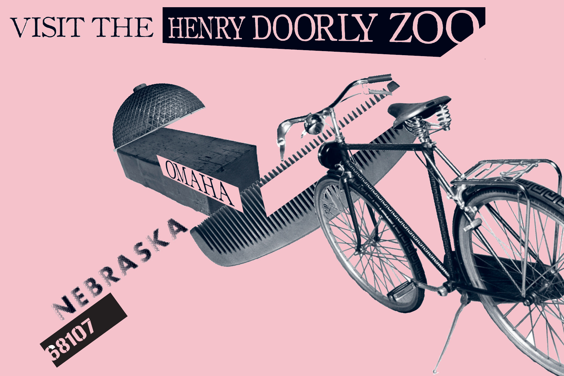
The second card is based on the style of Ed Fella, a famous educator from the
California Institute of the Arts, while showcasing Nebraska’s Henry Doorly Zoo. Fella’s photography work is what ultimately inspired the composition, taking cues from the abstraction of both physical- and letterforms as well as their monochromatic quality. In addition to these things, I also organized the forms to create subliminal letterforms, primarily a “Z” with the diagonal and two “O”s with the bicycle wheels.
California Institute of the Arts, while showcasing Nebraska’s Henry Doorly Zoo. Fella’s photography work is what ultimately inspired the composition, taking cues from the abstraction of both physical- and letterforms as well as their monochromatic quality. In addition to these things, I also organized the forms to create subliminal letterforms, primarily a “Z” with the diagonal and two “O”s with the bicycle wheels.

